Infographic Resumes For Executives
I hear you. You are considering getting yourself one of those nifty new infographic resumes. No kidding. I love them, too! Truly fascinating and so visually ‘appetizing’.
I am thrilled to see the recruiting and career services industry embrace more creative career marketing tools.
Are they right for everyone? Are they appropriate advantageous for executives to use during their executive job search campaign?
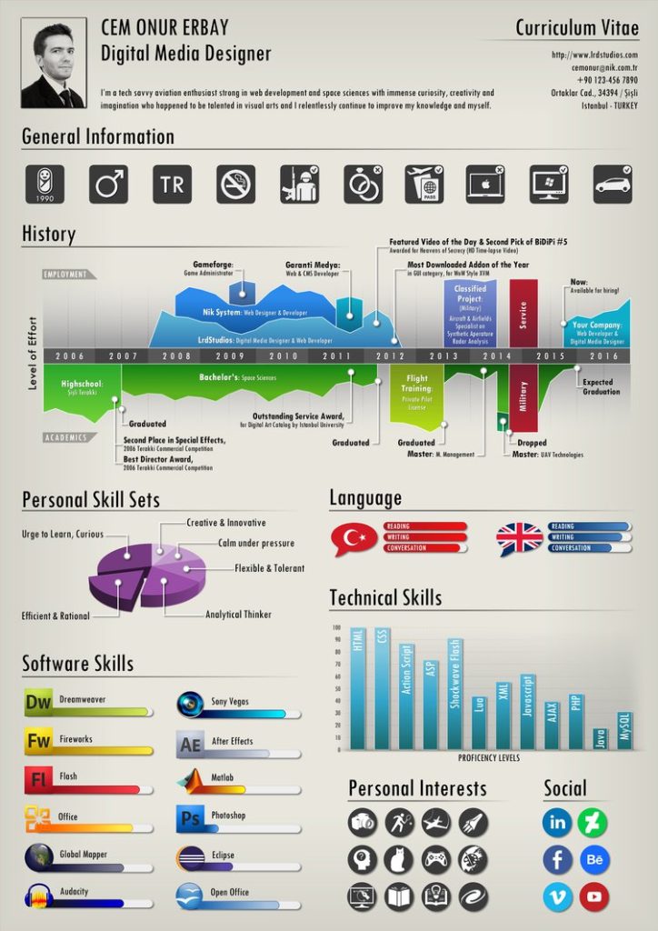
If you don’t know what an infographic resume is, please review the beautiful sample below that I sourced from deviantart.com website.
First, allow me to advocate for infographic resumes. I genuinely do encourage those who can utilize infographics effectively to do so. Why not? Let’s analyze the above infographic resume.
- It looks amazing! For sure this candidate will attract more attention than his competitors.
- It quickly gives you an impression of this job seeker’s design skills.
- Technical competencies are easy to identify and to compare based on strengths.
- Career history offers a great visual timeline.
One important thing that is missing is the story. And perhaps at this job seeker’s level and based on his job target, he doesn’t need a story.
As an executive/leader, you do!
At the executive level, the question isn’t if you can do the job. The real question you must answer is, “What change did you create with the opportunity you had and what will you do with the role they will give you now?
Your Executive Career Tale
Am I arguing against infographic resumes –> no!
As someone who enjoys the creative aspect of resume writing and website development, I can tell you that I will gladly create one of these infographic resumes for the right candidate.
What I am here to get across is that as an executive, you should not be so quick to employ an infographic resume and sacrifice YOUR story for visual impact.
What if you could do both?
How about an executive resume with graphic elements (graphical resume) that PUSHES the story FORWARD!
Integrating visual design to complete, support, strengthen, or facilitate your marketing message is a great idea.
If you are going to create a graphical resume, here is my recommendation:
Tell your story first. Write your executive resume with a focus on the distinction you offer as a member of the senior executive team.
Sell your value offer. What does your distinction mean for your future employer? Why should they care?
Support your position. Use relevant accomplishments and angle them to support your value offer.
Carefully and sparingly choose graphical elements. Design on-brand visual aids that will help move your story FORWARD and produce an influential presentation.
How to convert your executive resume into a graphical resume that moves your story FORWARD!
What needs to be said visually?
What could be said BETTER visually than in writing?
What is your executive DNA? Can you give hiring managers a better understanding of your distinction with the help of a visual dossier?
Do you have a diverse or unique experience that would be simplified through the use of a graphic?
Visual presentations, as you know, have their place in the business world. However, as you also know, they have to be intelligently prepared, easy to understand and must achieve something that a black and white traditional resume/presentation cannot.
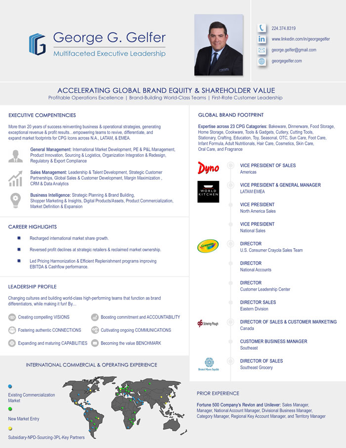
Allow me to share an example of a graphical networking resume that we created for a client. Notice that the writing and the graphic elements are proportionally leveraged to provide an overview of George’s career history and accomplishments. Keep in mind that this is a networking resume (meaning it is a one-page tool that the client uses to network).
George also owns a two-page CV for online distribution and to formally interview with recruiters and hiring managers — and while that CV isn’t black and white, it is not an infographic resume.
Example #1:

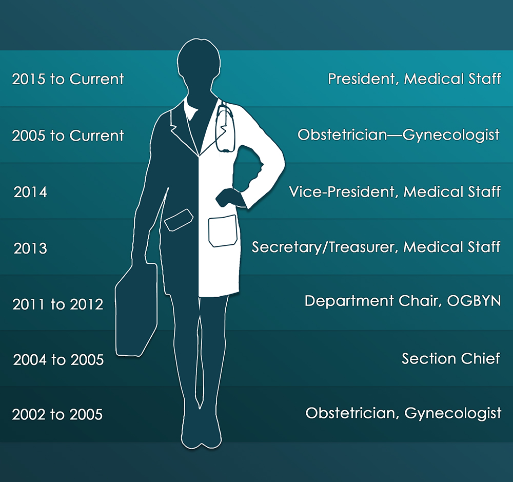
Example #2:
This visual timeline below is for an executive who wished to demonstrate her ability to step into a business executive position while still offering the strengths of her MD qualifications. The rest of her executive resume followed a more traditional layout with all two pages in the narrative form.

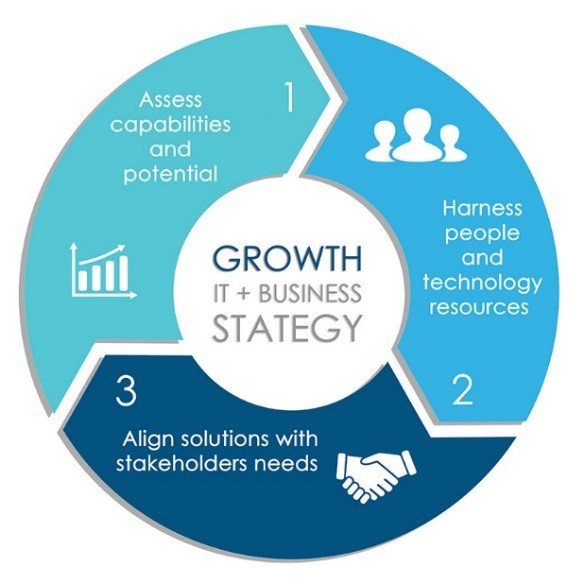
Example #3:
This chart below was used to help a CTO tell the story about an executive who builds world-class IT infrastructures and teams to provide companies with a competitive advantage. The rest of the marketing doc was entirely content strategy.

Example #4:
The following timeline was created for an international executive whose broad and cross-functional experience was initially conveyed in a 4-page CV. Phew!
Unfortunately, the anchors of his executive story were not easily identified within the content of his CV because he has accomplished so much. A quick view of his career diversity and the value it offers was presented visually front and center on his new 3-page CV. The rest of the CV unfolds to add value.

The bottom line: Yes, you can create a more graphical resume as an executive. However, I would not recommend a full-blown infographic. Not only would it not be a mature ‘look and feel’ for your executive brand, but won’t tell your entire story.
And while I truly enjoy the creative side of things, truth be told, there are times when you don’t need to tell your story with graphics. There are times when your traditional resume is the BETTER choice. It happens. As it is with everything in life –> it depends!
Questions you must answer before you decide to create a graphical resume: What are you trying to say? Why do you want to say it this way? Will it deliver the results you seek? What is your risk tolerance? :-)
Have fun!
Rosa Elizabeth Vargas
Certified Career Management Coach
Certified Master Resume Writer
www.careersteering.com
